BMA Artwork
1. Picasso
I took the most interest in Picasso's piece, "Mother and Child," because of its calming look. The lines are drawn with different thickness. It appears that Picasso created thick lines by going over already existing ones. The thin lines were either created by using a lighter shade of the brown color or pressing down on the canvas lighter than he did to create darker lines. Most of the lines are broken, not many connect to one another. The majority of the lines are curved; there are only a couple obviously straight lines that were drawn as the legs of the mother. All of the lines are the same brown color, some with a darker and some with a lighter tone. The focal point was the child, particularly his head. The mother's eyes are set on him as well as the bird's head, so both of these are leading lines. My eye path goes from the child's face, to the bird because the child is looking at it, and then the mother's face because she is looking at the bird. My eyes then go to leaves because they are isolated in space and not really connected to anything. There are also two L-shapes in the bottom of the the piece that represent the chair that the mother is sitting on. Overall, the painting is soothing. I think it is meant to be an organic piece meant to show an organic moment. Picasso uses the coloring wisely because he sticks with earthy tones and does not fill in the organic shapes with harsh and strict coloring, but rather lays down the background colors first (it looks like) and then goes over it with the brown, outlining lines.

2. Matisse
Looking back, Henry Matisse's piece "Small Romanian Blouse with Foliage" is similar to Picasso's painting that I described first. It looks like Matisse lays down his sketch first in the pencil and then paints loosely in the lines. Rule of Thirds was employed in his painting, the red line on the left side, the edge of the yellow line the middle, and the last orange line all the way on the right divide the piece into three sections vertically. You can also say that the Golden Triangle is found in this piece; the top angle starts at the top green leaf, the right angle is at the end of the arm of the chair on the right, and the left angle is the end of the woman's pants on the left side. The triangle encompasses the woman totally. I think Matisse was looking at this woman and very effectively interpreted her expression into the waiting. She is looking at him in disdain almost, she is giving him a "judgy" look. The bright colors represent for me her fiery attitude.

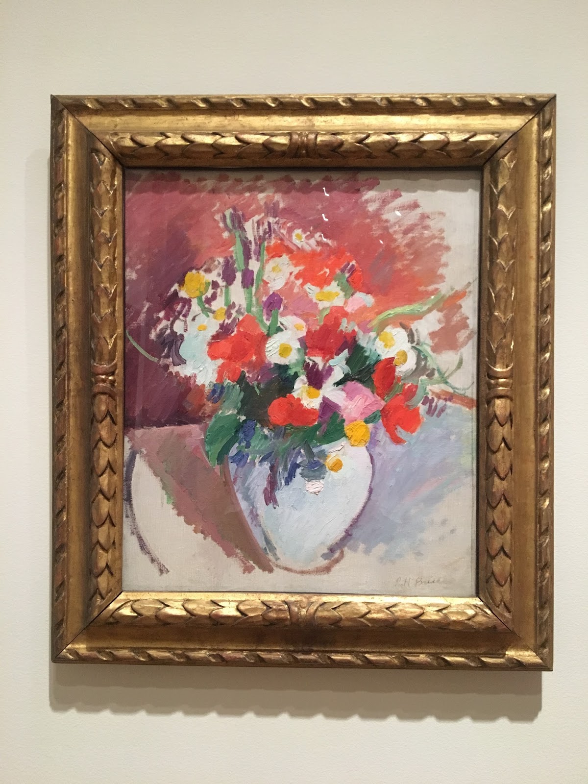
3. Bruce
Patrick Henry Bruce's piece "Still Life: Flowers in a Vase" I found the least interesting out of the three, only because the main quality of the painting that attracted me to it was the bright colors. He employs shading well and expressing shadows by using darker colors and variations of that same color behind the vase. There is an L-shape found in the piece that makes up the edge of the table and the edge of the shadow on the left side of the painting, all in the mauve color. I like how he used organic shapes to represent the flowers because your eye fills in the rest of the flower shape for you. There are leading lines represented in the green stems of the flowers that direct your eye path to the outside of the painting. Bruce's piece was interesting to me because I think he did it so that the viewer can interpret the flowers individually, no two viewers would see the flowers the same. I enjoyed the bright colors and the efficient strokes of his brush; he didn't need that many "perfect" lines to create the flowers in a vase.
Comments
Post a Comment